Editorial Systems

A Cover and Inside Page Should Feel Related Not Identical

Establishing visual kinship between an expressive exterior and structured reading columns requires shared underlying DNA rather than duplicated surface geometry.

Document Overview

Establishing Cohesion Across Document Boundaries

When opening any publication, the transition from exterior packaging to internal spreads determines whether reading feels natural or jarring. A common trap in brochure layout projects is mechanically cloning cover motifs onto editorial pages. Real unity emerges instead from disciplined proportions, shared baseline intervals, and balanced tonal accents that respect functional shifts.

Editorial Specifications

Layout Discipline
CorelDRAW multipage layout
Systemic Type
Systematic typography
Format Purpose
Brochure layout
Grid Architecture
Dual 6/12 Column Hybrid
Baseline Measure
11 pt / 15.5 pt Leading
Page Family Scope
Exterior Shell vs. Interior Content
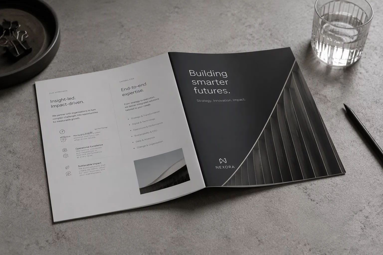
Corporate brochure lying half-open showing cover design transitioning into structured inner spread
01

Shared Proportional Systems Over Cloned Decoration

The cover of a document functions as a poster, whereas interior spreads operate as structured environments for reading. In CorelDRAW multipage layout setups, novice designers often copy prominent cover vectors or giant title blocks directly onto running pages. This creates cluttered spreads where huge display treatments fight with paragraph copy.

Instead of duplicating visual weight, extract mathematical ratios. Let the margin widths, column gutters, and vertical baseline grids echo the structural backbone established on the front cover. When internal columns inherit proportional spacing from the primary cover grid, pages feel related through cadence rather than repetitive ornaments.

  • Derive interior margins directly from the outer cover bleed and trim proportions.
  • Limit shared colors to purposeful accents like running headers and folio rules.
  • Use proportional sub-multiples of cover display type sizes for interior headings.
02

Typographic Continuity Across Varying Text Densities

A cover typically hosts scarce wording with bold focal statements, while subsequent articles require continuous body text and tables. Maintaining consistency across such divergent densities demands rigorous control over typography. The typeface pairing chosen for the front must behave reliably when scaled down to narrative columns and captions.

A cover acts as a provocative announcement, while the inside page sustains an ongoing dialogue. Repeating the shout across inner spreads destroys the reading experience.
— Amelia Rossi, Editorial Systems Designer

Apply font weights systematically. When the exterior relies on an ultra-bold display cut, allow inside editorial section headers to feature medium or semibold iterations from that exact typeface family. This technique anchors identity while providing the contrast needed for prolonged reading comfort.

03

Calibrating Pacing and White Space Transitions

Moving from an expansive cover into dense multi-column layouts can disorient readers if the transition is too abrupt. An effective brochure layout employs introductory breathing room on pages two and three, easing the audience into denser informational segments.

Establish a deliberate editorial rhythm across the initial spreads by following three core layout calibrations:

  1. Allocate generous white space above introductory summaries to soften the transition from the bold cover art.
  2. Anchor running footers, page markers, and document titles to identical vertical coordinates on every spread.
  3. Introduce secondary breakout sidebars that match the geometric orientation of cover imagery without copying its scale.
Layout Consultation

Build Systematic Multipage Layouts

Consult with our editorial specialists to calibrate proportional grids, font hierarchies, and cohesive document families across complex print publications.