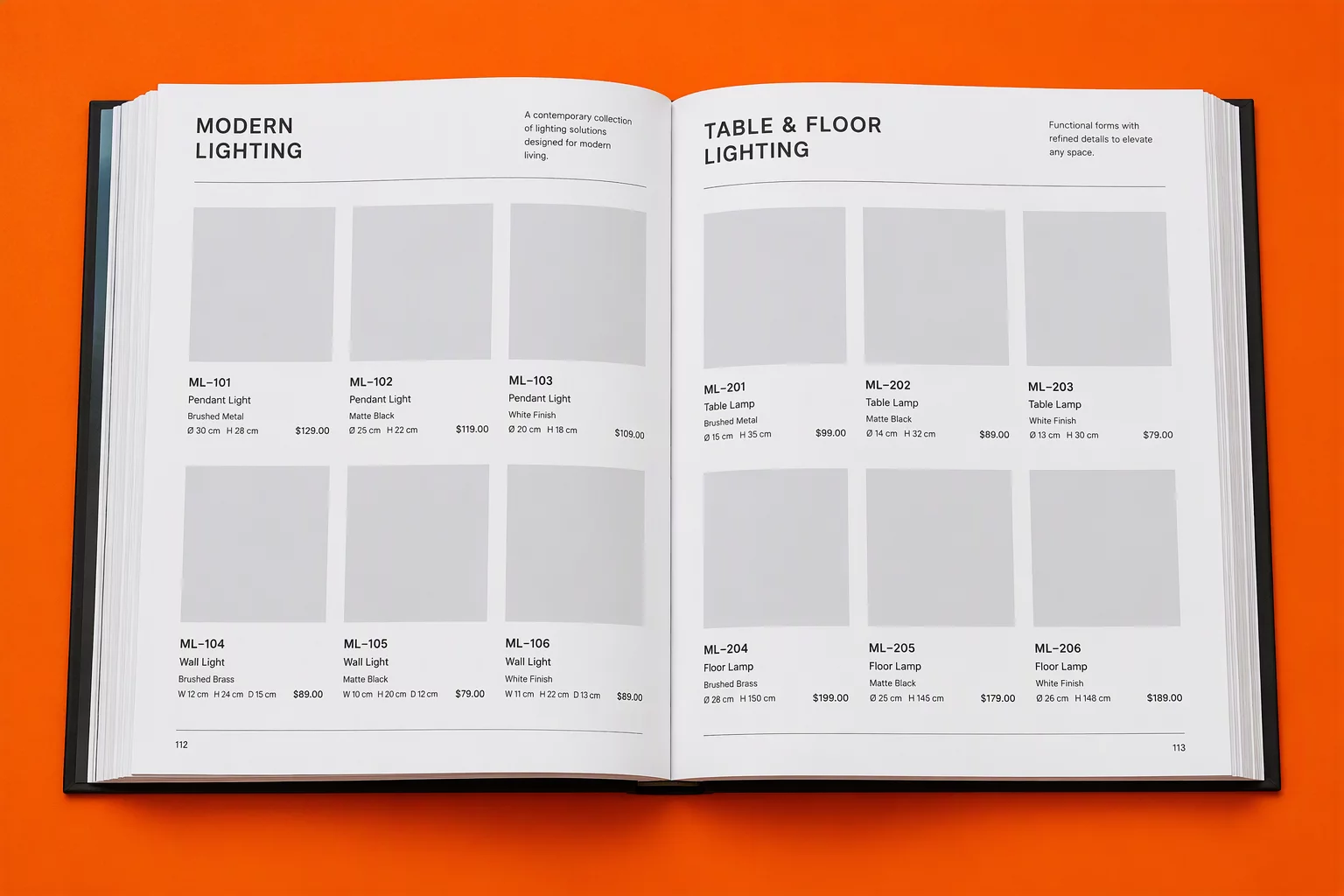
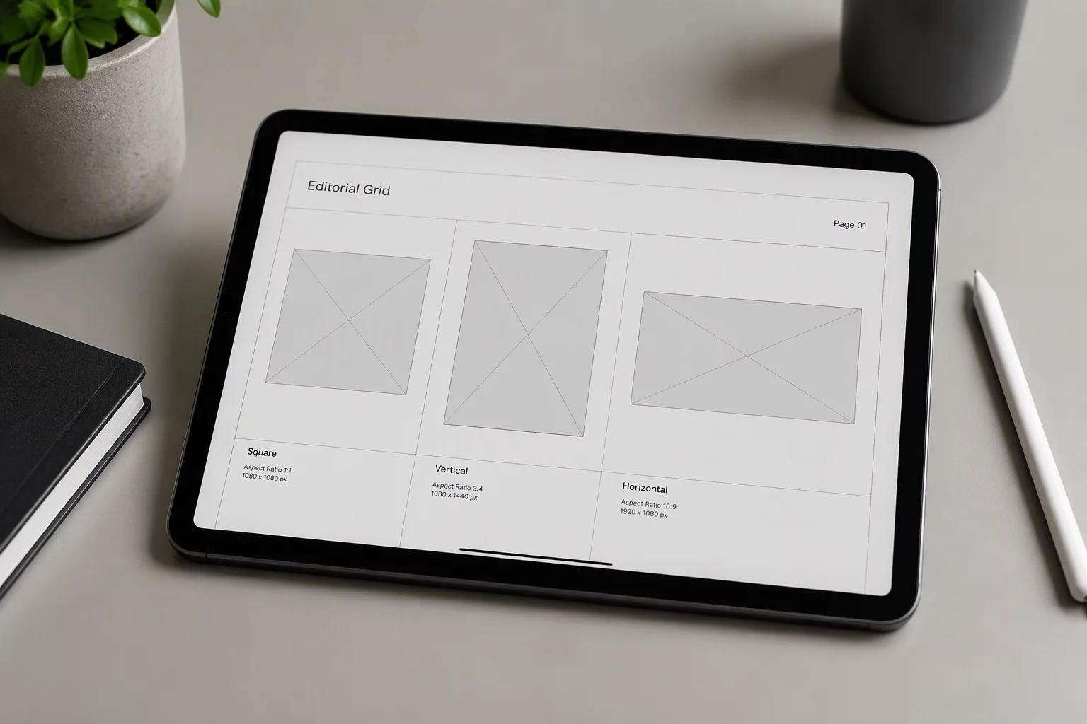
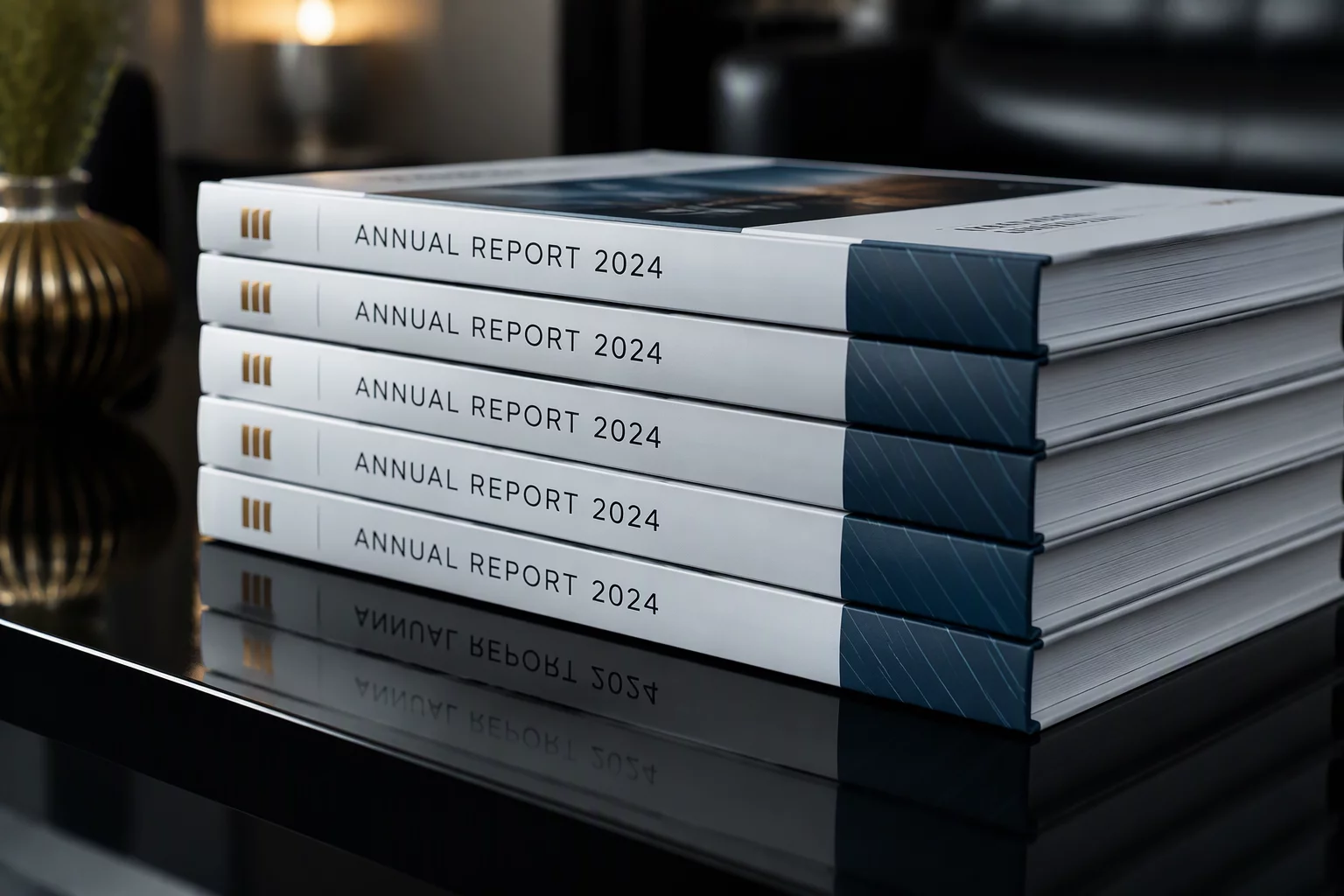
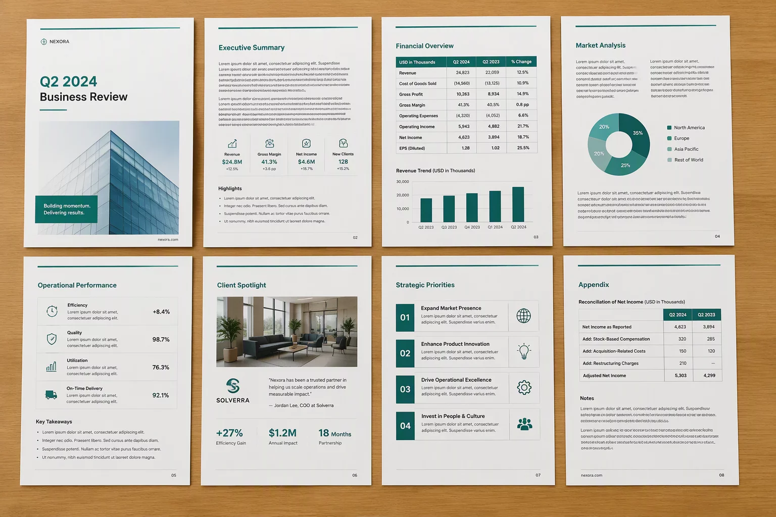
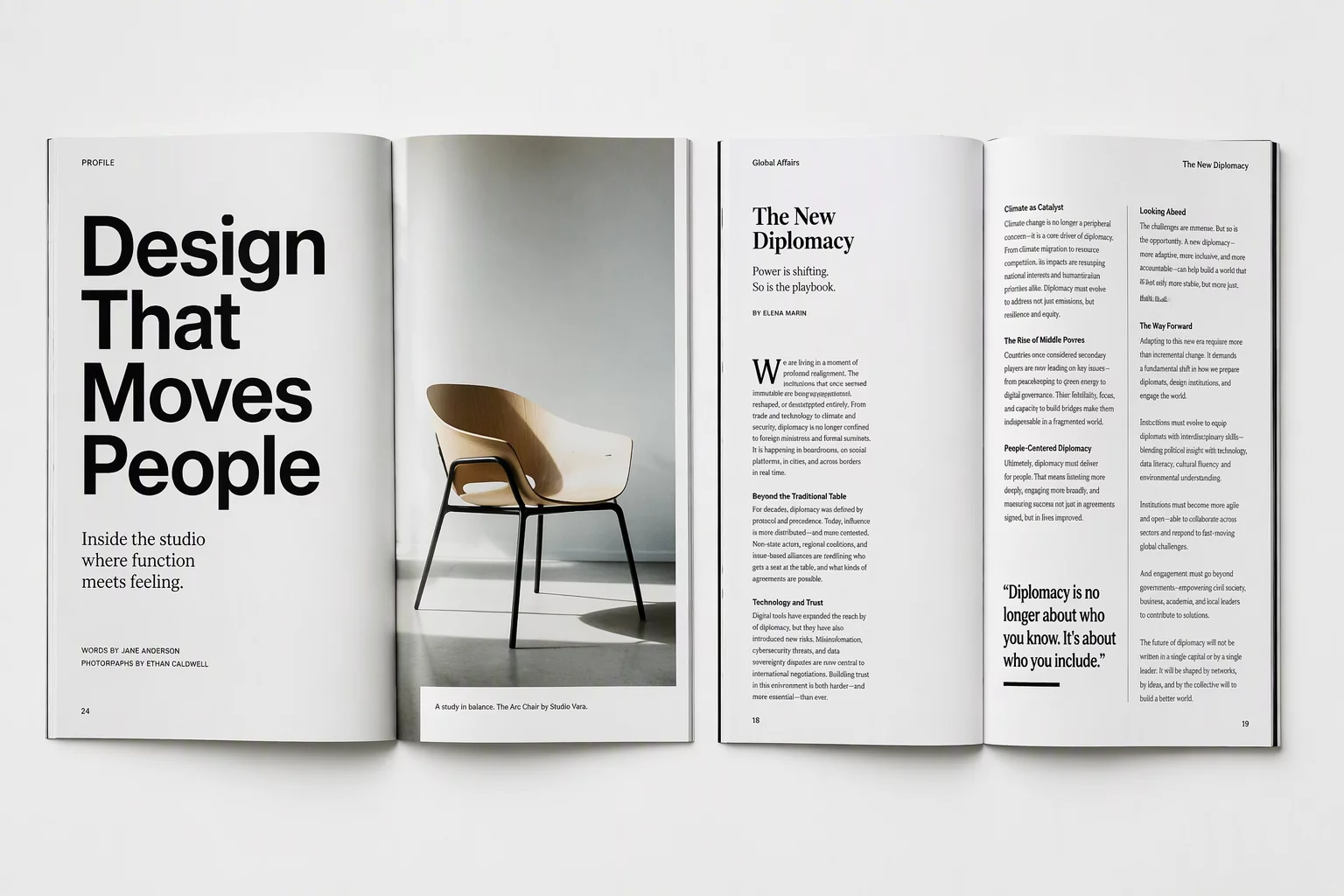
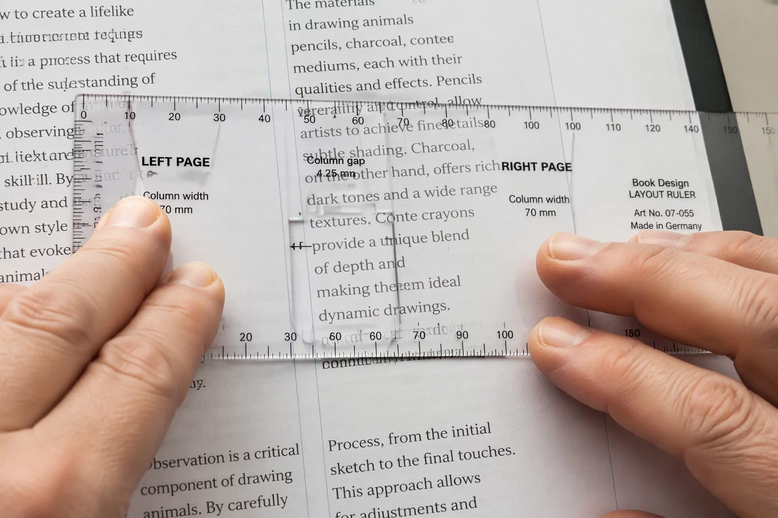
Balance shared baselines, variable column counts, and responsive modular rhythm without rigid visual repetition.
Structural Overview
Architecture
The core structural dimensions that shape every page system across our layout studies.
01
Page Families
02
Type Hierarchy
03
Image Ratios
04
Short vs Long Copy
05
Recurring Elements
06
Multipage Cases
07
Format Changes
Notice
Platform & Editorial Disclaimer
Independent educational analysis and structural publication principles
Important Informational Notice
CorelDRAW is the third-party vector illustration and page-layout environment referenced in this guide. PageFamily Workshop is an independent educational publication about multipage structure, typographic hierarchy, image variation, recurring elements, and layout consistency. PageFamily Workshop does not provide CorelDRAW software, CorelDRAW Web accounts, subscriptions, templates, cloud storage, official training, or technical support.
Clear structural standards reduce design review cycles, eliminate print formatting discrepancies, and ensure publication integrity across complex corporate publications.
100%
Unified Multipage Flow
Maintain absolute grid alignment and uniform master structures across every CorelDRAW multipage layout, eliminating manual corrections between spreads.
Zero
Editorial Rhythm
Enforce structured type scales and baseline grids so complex editorial typography stays crisp and perfectly legible across all document sections.
4x
Predictable Handoffs
Transform intricate multi-fold and booklet requirements into modular brochure layout frameworks that pass commercial print specifications on the first run.
1:1
Modular Structure
Standardize reusable section components so creative teams deliver identical production quality whether issuing a quick overview or a comprehensive report.
Inside The Workshop
Where Document Architecture Meets Living Craft
Behind every rigorous grid system and editorial template is a dedicated team of publication designers reviewing press proofs, calibrating margins, and harmonizing typographic scale.
100%Proofed by hand
Live inspection of physical spreads ensures that baseline grids, running heads, and page numbers hold up across consecutive folios.
Daily Studio Practice
Systematic Layout Standards
Grid Discipline Across Formats
We stress-test our layout grids against changing word counts, asymmetrical captions, and varying headline weights.
Physical Print Scrutiny
Every guideline is printed, folded, bound, and analyzed under directional lighting to catch visual fatigue before publishing.
Transparent Editorial Dialogue
Editorial designers and typographers meet directly over working proofs to refine spacing rules and rhythm consistency.
A disciplined, page-by-page method ensuring visual cohesion, grid integrity, and systematic balance across complex print and digital publications.
01
Initial Scope & Architecture
We evaluate document hierarchy, volume of content, and editorial intent before creating guides. When establishing an agile brochure layout, we determine master frames, page rhythm, and pagination early.
Stage OnePlanning
02
Grids & Typographic Baseline
Our specialists calibrate vertical rhythm, proportional column spacing, and text scale rules. Consistent headline-to-body typography guarantees that each multi-column spread remains comfortable to navigate.
Stage TwoFoundations
03
Assembly & Document Build
We construct your CorelDRAW multipage layout utilizing linked text flows, custom master pages, running headers, and shared styling assets to prevent formatting drift across chapters.
Stage ThreeExecution
04
Preflight Review & Handover
Every bleed zone, linked graphic, and color separation undergoes meticulous validation. Files are handed over as optimized, error-free packages ready for press or digital release.
Multipage publications demand cohesive grid logic and typographic tension. Compare how our systematic editorial framework compares against typical single-page asset kits.
Workflow Dimension
Isolated ApproachGeneric Asset Packs
PageFamily WorkshopSystemic Document Engineering
Baseline & Modular GridStructural vertical rhythm across varying page depths.
Rigid per-page frames
Elements snap arbitrarily with no uniform baseline, causing mismatched leading across spreads.
Unified 12-column baseline math
Mathematical grid locks margins, text boxes, and micro-gutters consistently across hundreds of pages.
Typographic HierarchyManaging heading levels, subheads, and body scale.
Unregulated font scaling
Manual ad-hoc point sizes cause inconsistent reading rhythm and untamed widow/orphan flows.
Strict scale ratios & styles
Predictable proportions guarantee contrast balance between short teaser copy and dense multi-column reports.
Editorial Multi-Ratio ImageryHandling diverse aspect ratios without disrupting layout flow.
One-size container forcing
Images get cropped awkwardly or break text wrap whenever incoming editorial photography changes orientation.
Cohesive modular frame system
Square, portrait, and panoramic frames cohere on the same layout rules without disrupting white space tension.
Cover-to-Spread NarrativeContinuity between exterior display and inner catalog pages.
Disjointed visual identity
Showcase covers clash directly with inner article spreads, looking like uncoordinated documents stitched together.
Harmonized editorial tone
Outer covers and interior multi-page chapters share consistent typographic weights, margin proportions, and pacing.
Contractor Quality Audit
What to Ask Any Layout Contractor Before Signing
Whether you partner with our studio or evaluate independent specialists, these essential questions uncover technical competency, prevent pre-press disasters, and protect document scalability.
01Architecture
How do you construct master pages and parent layout spreads?
Verify whether the contractor uses structured master sheets, persistent baseline alignments, and automated running headers, rather than copying static elements manually across individual pages.
How are paragraph and character styles nested for long-form copy?
Untrained operators apply manual font sizing and inline overrides. In large multipage catalogs, this causes uncontrollable drift and broken tracking across revisions.
Look for: A strict hierarchical style sheet, automated keep lines to prevent orphan words, and optical margin alignment.
03Pre-Press
Which color conversion workflows and ink limits do you enforce?
Placing raw RGB photography directly into CMYK print files results in dull muddy prints, oversaturated plates, and unexpected text halftoning on press.
Look for: Pre-flight validation, explicit ICC profiles, total ink limit caps (TIC 300%), and 100% vector K-channel black body copy.
04Architecture
What baseline grid increment dictates your leading and gutters?
When text columns stand side by side on facing spreads, misaligned baselines immediately destroy the reading tempo and make multi-column designs look disjointed.
Look for: A mathematically unified baseline grid (such as 12pt or 14pt leading multiples) locked across spreads.
05Pre-Press
How do you manage linked assets, resolution, and bleed margins?
Embedding unlinked bitmaps into document roots causes bloated files and undetected 72 DPI artifacts that ruin expensive press runs.
Look for: Linked high-resolution assets (minimum 300 DPI at 100% scale), 3mm–5mm uniform bleed, and complete package archives.
06Typography
Do you provide pristine source files ready for internal team handoff?
A publication project is never complete if future revisions lock out your in-house marketing department due to missing font definitions or unstructured layers.
Look for: Layered native source files, clear naming taxonomy, documented color palettes, and open licensing parameters.
Document Architecture
Latest Editorial Layout Articles
Practical investigations into typography hierarchy, CorelDRAW multipage layout balance, and structured grid workflows for modern publications.