Typography & Layout

Short Copy and Long Copy Need Different Tension

Why micro-burst headlines demand acute visual compression while editorial narratives require sustained rhythmic breathing room.

Document Overview

Dynamic Pressure Between Punchlines and Paragraphs

When short display copy and dense narrative share the same document, using identical spatial rules collapses both. Effective brochure layout orchestrates high kinetic pull for brief statements and low-friction ease for continuous reading columns.

Editorial Specifications

Layout Discipline
CorelDRAW multipage layout
Systemic Type
Systematic typography
Format Purpose
Brochure layout
Grid Architecture
Dual-Modality 12-Column Editorial Grid
Baseline Measure
13 pt Baseline Rhythm on 4.5 mm Modules
Page Family Scope
Editorial Spread System & Catalog Narrative
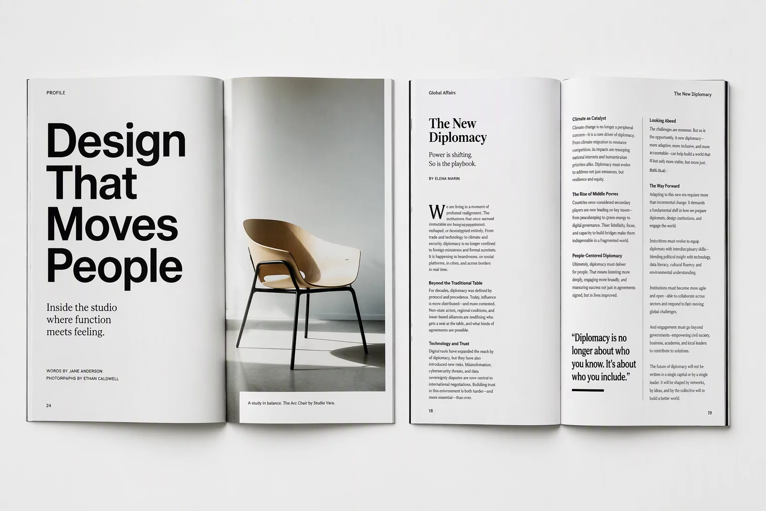
Two open editorial magazines illustrating visual tension and spacing differences between bold sparse headlines and dense narrative text
01

Structural Friction in Micro-Copy

A three-word phrase operates like an architectural anchor rather than a continuous thread. In CorelDRAW multipage layout workflows, tight display headers withstand deliberate kerning squeezes, oversized ascenders, and asymmetrical white space because the viewer consumes them in a single cognitive pulse. The typographic energy must snap immediately, holding the surrounding empty field under tension.

Short copy collapses the moment designers treat it like regular body text centered in an arbitrary box. When a kicker or callout floats without tangible tension toward the spine or margin, it loses authority. Establishing acute counterweights between massive glyphs and sharp tracking transforms brief statements into decisive visual waypoints.

  • High-contrast scale shifts: pairing 48 pt titling directly against generous negative margins.
  • Controlled tracking compensation to sharpen display silhouette edge definition.
  • Spatial anchoring that aligns the baseline strictly to active page margins rather than arbitrary midpoints.
02

Sustained Cadence in Continuous Narrative

Narrative passages reject the sudden shock tactics that make headlines sing. Once reading stretches beyond forty words, typography must retire into an uninterrupted acoustic chamber where line length, leading, and character proportions maintain tranquil consistency across page turns.

Short copy demands an electrical charge across empty borders; long copy survives solely on invisible, uninterrupted pacing.
— Elena Rostova, Senior Editorial Lead

In dense multi-column sections, excessive friction fatigues the eye within seconds. Achieving balanced page architecture means calibrating column widths to 55–65 characters per line while anchoring every paragraph strictly to the baseline grid. This rhythmic discipline gives lengthy text blocks the steady momentum essential for sustained comprehension.

03

Harmonizing Opposing Pressures Across Spreads

The genuine craft emerges when a spread pairs an expansive pull quote or high-impact claim opposite three columns of detailed analysis. Rather than compromising both into a tepid middle ground, modern layouts celebrate the polarization between dense gray matter and dramatic visual apertures.

Resolving this dual pressure across master pages demands a disciplined three-tiered routine:

  1. Calculate gutter allowances so negative space around short copy never bleeds into body text margins.
  2. Lock both display frames and continuous columns onto identical baseline subdivision increments.
  3. Test spread balance under 20% zoom reduction to verify that the headline commands attention without eclipsing the reading path.
Layout Consultation

Calibrate Your Multipage Grid Systems

Need help orchestrating balanced typographic hierarchies across complex corporate literature or annual reports? Submit your brief to our studio desk.