Editorial Systems

Three Image Ratios One Editorial System

How disciplined modular proportions bring structural calm and dynamic pacing to complex publication spreads.

Document Overview

Unifying Frame Geometry Across Complex Multipage Documents

When graphic documents expand beyond twenty pages, visual monotony sets in if every graphic container shares identical dimensions. Uncontrolled image crops create erratic whitespace and tear apart the underlying framework. Adopting three disciplined ratios—a panoramic 16:9 anchor, a 4:3 narrative standard, and a 1:1 focal square—builds an elastic hierarchy that respects baseline grids while giving each page its own voice.

Editorial Specifications

Layout Discipline
CorelDRAW multipage layout
Systemic Type
Systematic typography
Format Purpose
Brochure layout
Grid Architecture
12-Column Compound Modular Grid
Baseline Measure
14 pt Baseline / 28 pt Rhythm
Page Family Scope
32-Page Corporate Publication
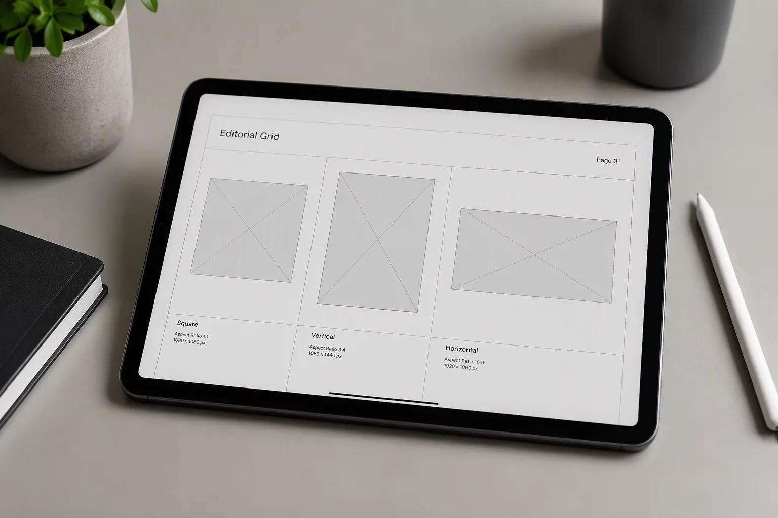
Digital tablet displaying an architectural grid system overlaid on three blank image frames: square, portrait, and landscape
01

The Panoramic 16:9 Anchor Frame

The widescreen horizontal frame establishes immediate presence across spread openings. Spanning either the full trim width or eight columns of a 12-column system, it crowns the upper portion of key chapter dividers. In our CorelDRAW multipage layout setup, snapping wide image boxes to vertical baseline increments ensures that running copy beneath remains perfectly synchronized with adjacent text blocks.

Architectural photography and expansive workplace scenes communicate best within this proportion. Rather than letting horizontal frames float at arbitrary heights, pinning their bottom boundary to uniform grid lines preserves vertical rhythm throughout consecutive spreads.

  • Spans six to eight columns to establish dominant visual hierarchy at section launches.
  • Locks to 28 pt vertical rhythm intervals to prevent baseline alignment collisions.
  • Accommodates landscape photography while protecting generous perimeter margins.
02

The Modular 4:3 Narrative Workhorse

While panoramic banners set dramatic atmosphere, descriptive chapters require a flexible workhorse. The 4:3 ratio provides ideal vertical balance alongside multi-column body text. When assembling a complex brochure layout, pairing a four-column 4:3 photograph with adjacent editorial columns maintains balanced visual weight without overcrowding surrounding negative space.

Restricting image proportions to three deliberate ratios prevents spread fatigue and turns modular guidelines into an effortless navigational roadmap.
— Marcus Vance, Editorial Lead

This classic proportion performs reliably for environmental portraits, process demonstrations, and product examinations. Its stable geometry enables production teams to swap imagery across catalog spreads without forcing text reflows or broken margins.

03

The 1:1 Focal Square for Case Callouts

The square ratio serves as an intentional visual pause against horizontal movement. Positioned within sidebars or nested into stat modules, square frames immediately direct the eye toward specific case highlights. Disciplined typography around these frames maintains clean line lengths and eliminates awkward word hyphenations.

Standardizing object styles and coordinate presets across master pages ensures identical dimensioning throughout long runs. Placing these square accents beside key quantitative points establishes a lively reading tempo across information-heavy spreads.

  1. Anchor square frames within three-column secondary modules or stat callout blocks.
  2. Apply uniform 14 pt gutters around text wrap boundaries to safeguard body legibility.
  3. Standardize caption placement strictly beneath the bottom baseline of the bounding box.
Layout Consultation

Calibrate Your Publication System

Need guidance defining modular proportions or balancing image density across long-form documents? Connect with our workshop specialists for structural recommendations.