Typography

Choosing Typefaces for Editorial Clarity

Balancing stroke contrast, x-height, and rhythmic reading cadences across long-form editorial spreads.

Document Overview

Structural Typography in Multipage Publications

Editorial legibility depends on subtle structural cues rather than striking decorative flourishes. When selecting typefaces for complex multipage publications, brochures, and reports, typeface pairing must support effortless continuous reading while establishing immediate hierarchy across headers, captions, and sidebars.

Editorial Specifications

Layout Discipline
CorelDRAW multipage layout
Systemic Type
Systematic typography
Format Purpose
Brochure layout
Grid Architecture
12-Column Modular System
Baseline Measure
14pt / 18pt Continuous Leading
Page Family Scope
Editorial Spreads & Reports
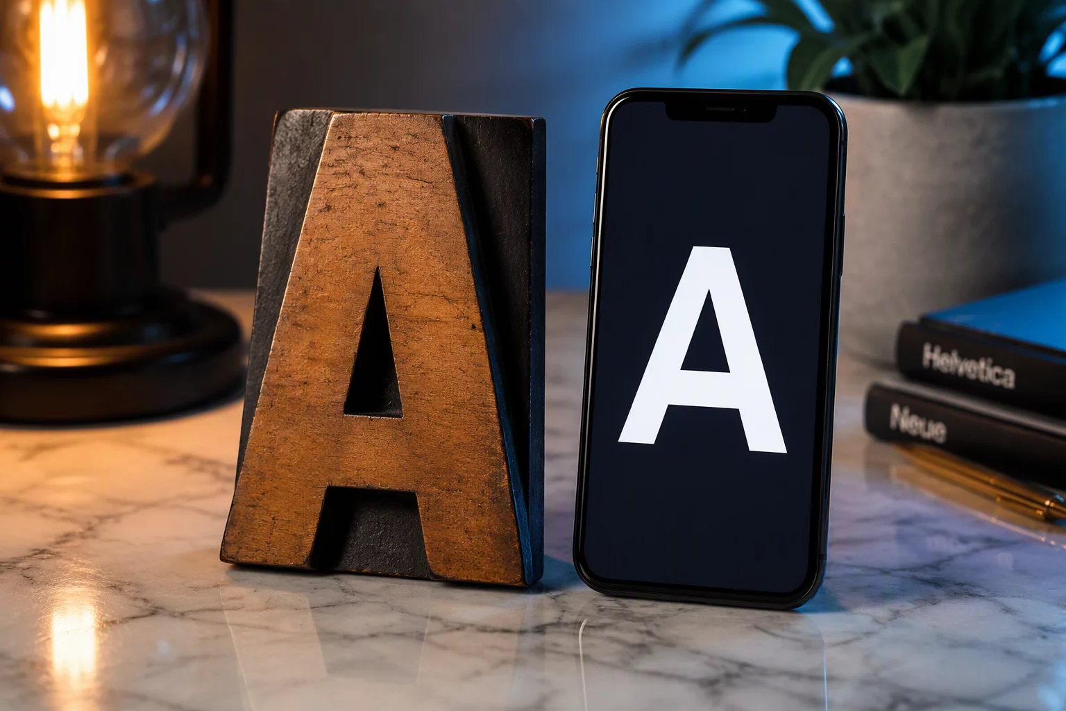
Traditional wooden letterpress type block sitting next to a modern smartphone screen displaying clean digital typography
01

Assessing X-Height and Proportions for Extended Reading

Body text forms the rhythmic texture of an entire publication. Selecting a primary text face demands scrutiny of its lowercase x-height, internal counters, and aperture openness. When x-height is overly compressed, characters close up at standard text sizes (9 to 10.5 points). Conversely, an exaggerated x-height crowds line spacing and tires the eye during continuous paragraph scanning across dense columns.

A reliable editorial text face maintains open counters and distinct character shapes to prevent glyph confusion, especially between numerals like 1, 7, and capital I, or lowercase l. In CorelDRAW multipage layout workflows, setting up linked text frames reveals whether a typeface holds its shape across varying column widths without requiring excessive tracking adjustments.

  • Verify open letterform apertures that remain legible even under newsprint or uncoated paper dot gain.
  • Ensure numerals include both tabular figures for data tables and proportional oldstyle figures for narrative running text.
  • Test true italics versus oblique slant styles to preserve tonal shift inside body paragraphs.
02

Pairing Contrasting Voices Without Introducing Visual Friction

Heading choices set the atmosphere, but pairing them with body copy requires disciplined harmony. An editorial system rarely needs more than two typeface families: a robust workhorse serif paired with a neutral humanist or geometric grotesque sans-serif. Visual friction occurs when two typefaces share nearly identical proportions yet diverge just enough to look like a typesetting error.

The goal of editorial typography is not to decorate information, but to remove cognitive friction between the printed word and the reader's comprehension.
— Sarah Lin, Senior Typographer

In brochure layout projects, pairing a high-contrast serif display face with a clean sans-serif secondary voice allows immediate differentiation of sidebars, captions, and navigational folios. CorelDRAW Graphics Suite paragraph styles ensure that baseline alignments stay locked across adjoining columns, preventing uneven optical weight across facing pages.

03

Establishing Calibrated Weights and Optical Rhythm

Typefaces behave differently across size scales. A headline set at 36 points reveals hairline serifs and tight terminals that disappear completely at caption sizes. When building an editorial hierarchy, verify that chosen type families feature dedicated optical weights or variable axes specifically drawn for display, subhead, body, and caption contexts.

Implementing systematic typography across multipage documents requires rigorous standardization. Each typographic tier must possess a defined measure, line height, and paragraph spacing rule:

  1. Calculate line lengths between 45 and 75 characters per measure to sustain reading comfort.
  2. Lock body text baselines to an underlying document grid to ensure cross-column horizontal alignment.
  3. Anchor caption and data styles with dedicated medium or semi-bold weights for rapid scanning.
Layout Consultation

Refine Your Editorial Type Architecture

Plan your next publication with calibrated type hierarchies, baseline grid harmony, and seamless multipage text flow.