Layouts Case Study

Magazine Editorial Spread Analysis

Unpacking the mechanics of double-page editorial rhythms, asymmetrical column divisions, and typographic harmony across spreads.

Document Overview

Deconstructing Double-Page Spread Dynamics

Analyzing a feature spread reveals how tension between dense narrative copy and open negative space directs editorial pace. In this study, we break down how deliberate gutter compensation, column asymmetry, and baseline snapping create an effortless flow across facing pages.

Editorial Specifications

Layout Discipline
CorelDRAW multipage layout
Systemic Type
Systematic typography
Format Purpose
Brochure layout
Grid Architecture
12-column modular with 4-column sub-divisions
Baseline Measure
13.5 pt leading on 9.5 pt body text
Page Family Scope
48-page cultural quarterly publication
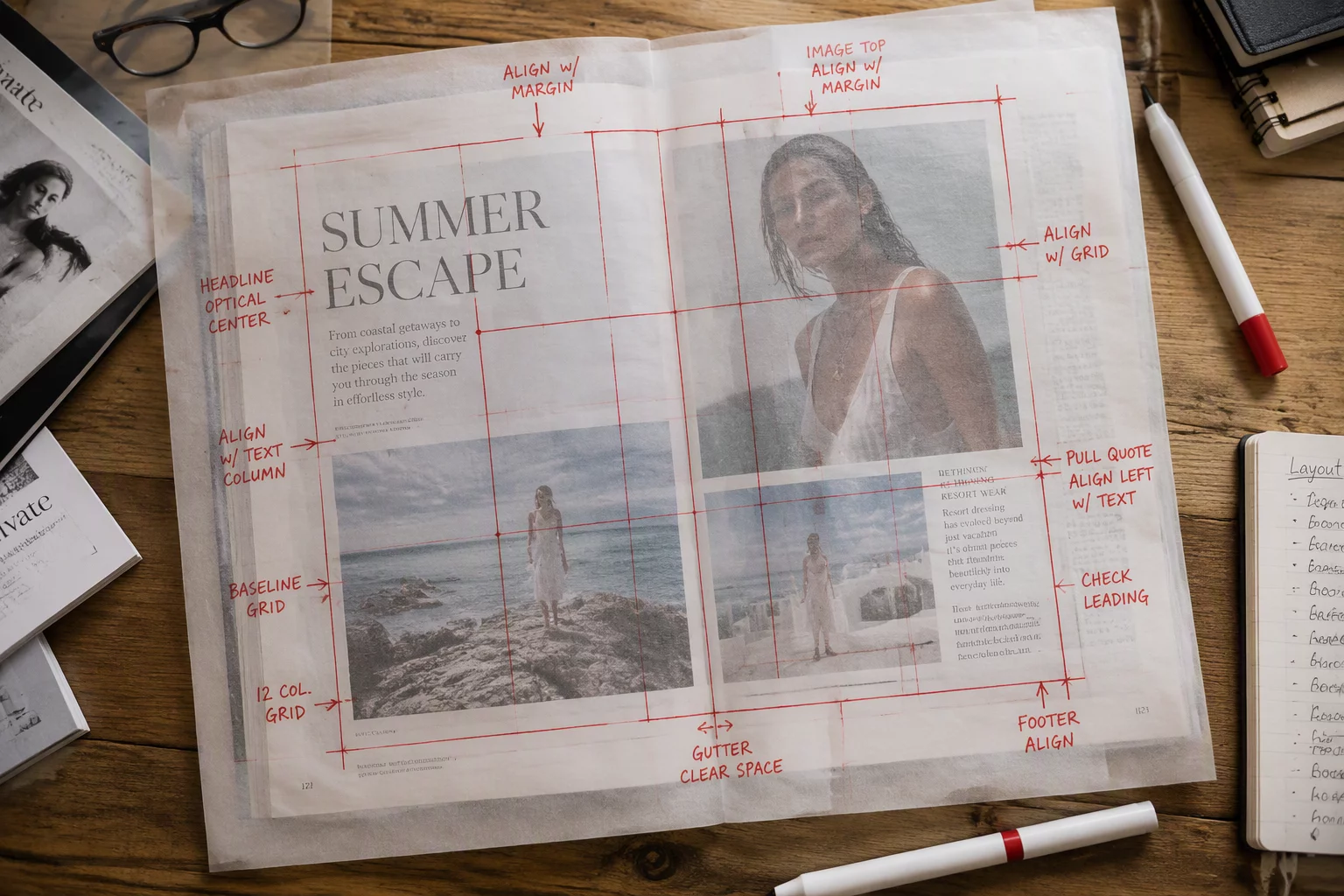
Top-down view of an editorial magazine spread with alignment tracing and grid notes
01

Establishing the Spine Bridge and Asymmetrical Margins

Facing pages never function in complete isolation. When bound together, the central gutter swallows visual space, demanding careful margin compensation to keep body text from vanishing into the fold. A successful CorelDRAW multipage layout begins with asymmetric inner margins that provide breathing room for the physical binding.

Outside margins need sufficient space to accommodate reader grip and running headers. Distributing white space unevenly builds dynamic momentum, nudging the eye naturally from the dominant left hero anchor toward the secondary right narrative block.

  • Gutter allowance calibrated to 22 mm to prevent inner text curvature.
  • Unequal horizontal margins establishing active white space along outer edges.
  • Running headers positioned above the primary grid envelope to preserve page rhythm.
02

Orchestrating Typography Hierarchy and Visual Anchors

Large headline units act as visual magnets across the entire spread opening. By setting the main feature heading across three columns on the verso page while letting introductory remarks breathe below, we establish immediate hierarchy before the reader tackles column blocks. Systematic typography ensures that drop caps, lead paragraphs, and pull quotes maintain consistent proportions throughout the document.

A spread lives or dies by its silence. Negative space is not empty leftover paper; it is the structural scaffolding that lets complex editorial typography speak clearly.
— Elena Rostova, Senior Editorial Art Director

Secondary entry points such as sidebars and pull quotes prevent reading fatigue. When planning a brochure layout or an editorial feature, treating supporting callouts as distinct graphic elements keeps long-form prose inviting and scannable without disrupting the underlying horizontal alignment.

03

Locking Down Baseline Harmony and Column Multiples

Micro-typographic precision defines high-end editorial production. If baseline grids drift between adjacent text frames, the spread loses cohesion and appears disjointed to the discerning eye. Aligning body copy strictly to an incremental baseline grid guarantees crisp horizontal balance even when illustrations disrupt continuous columns.

Working across varying content components requires a systematic column strategy. Sub-dividing standard columns allows caption fields, multi-scale photography, and metadata to fit comfortably within the overarching document framework:

  1. Snap all body copy, captions, and section headers to a unified 13.5 pt baseline increment.
  2. Employ 4-column and 6-column hybrid divisions for versatile imagery placement.
  3. Maintain strict optical balance across the central divide to unify facing pages.
Layout Consultation

Need Expert Guidance on Your Publication Architecture?

Discuss your publication challenges, baseline grid calibrations, and multipage structure with our editorial layout specialists.