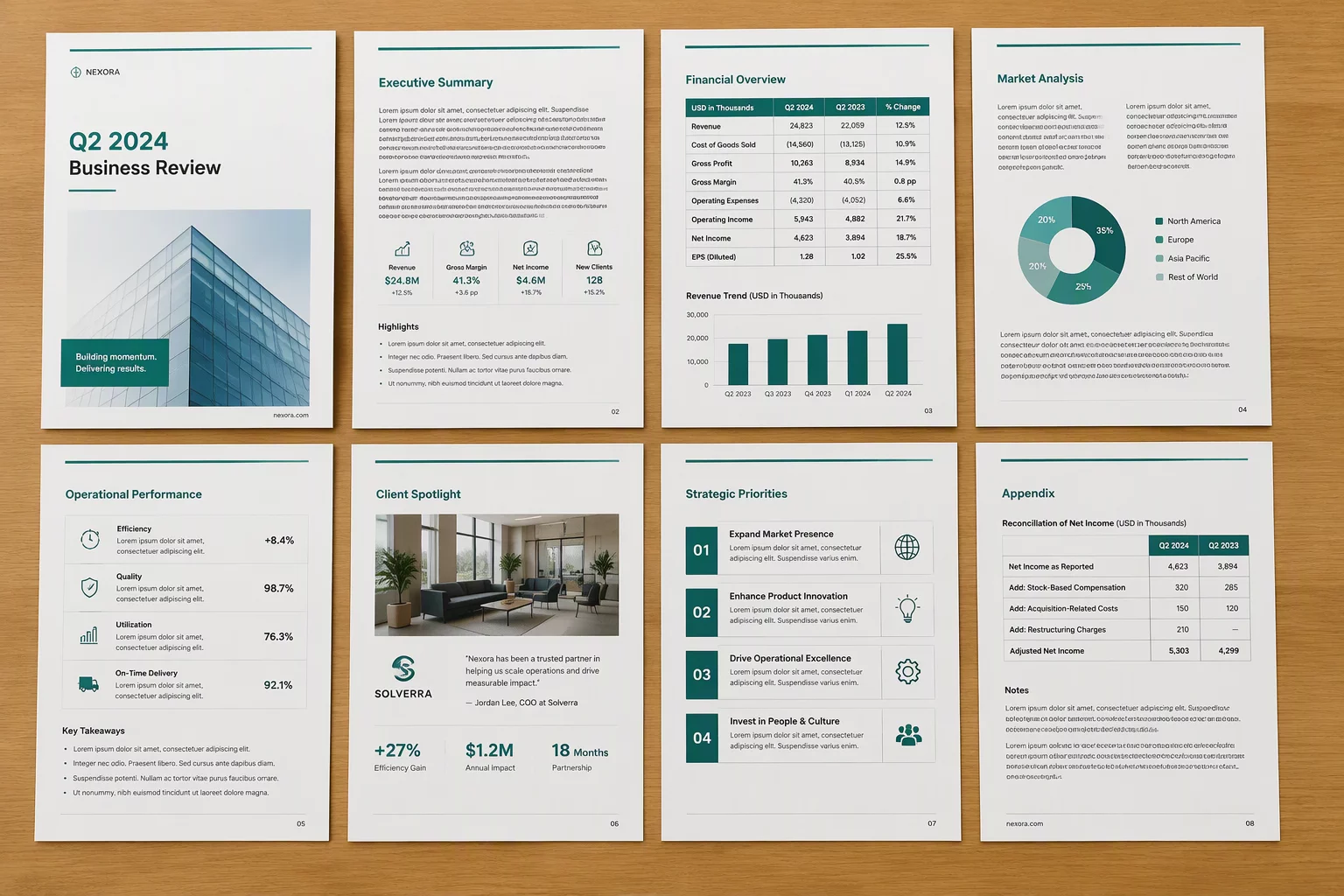
Multi-page publications rarely fail because their individual spreads look clumsy; they disintegrate because each page type invents its own structural rules. In an extensive brochure layout, a technical spec table, a full-bleed photo portfolio, and a two-column interview must share an underlying geometry. When developing our layout templates, we rooted every spread in a compounding twelve-column grid that cleanly divides into halves, thirds, and quarters.
Standardizing margins establishes the first anchor. By fixing outer boundary gutters at twenty-four millimeters and top header bands at eighteen millimeters, the reader's eye navigates varied content without re-orienting to new document edges on every turn. In modern CorelDRAW multipage layout setups, utilizing master guidelines across linked layers preserves this geometric continuity across all eight working spreads.
- Symmetric outer gutters anchor running headers and folios regardless of internal column division.
- Modular vertical zones allow headline blocks and media frames to align horizontally across adjacent spreads.
- Micro-columns group dense technical tables without overflowing the master document boundaries.